Hey there — ever feel like you're designing the same website over and over? Maybe your layouts start looking a little too familiar, or your creative spark feels more like a flicker? You're not alone.
As we navigate the digital landscape of 2026, one truth emerges: websites are no longer static destinations but living ecosystems. Having tracked the pulse of digital design for over a decade, we've witnessed how visual aesthetics, interaction patterns, and technical foundations converge to create meaningful user journeys. While predictions are inherently uncertain, here's where the current trajectory leads us.
Hey everyone, let's talk about a super important but often overlooked point in custom website development — "Mobile-First"!
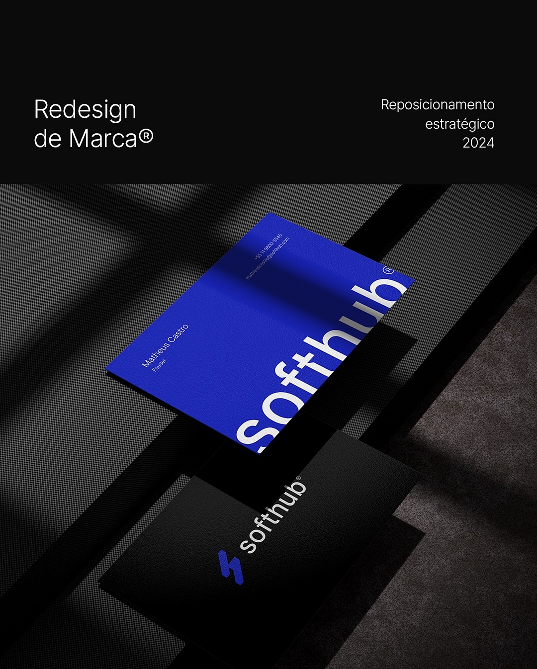
A great VI system goes beyond a new logo—it's about creating a consistent, distinctive identity across everything, from business cards and packaging to websites and signage.
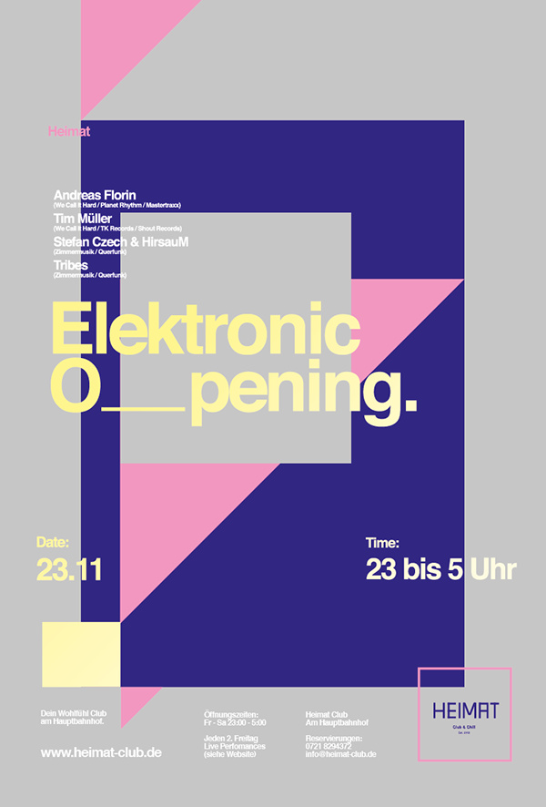
Poster design truly tests a visual designer's skills: layout, aesthetic sense, and ability to grab attention. Let's explore 7 sleek, minimalist poster designs that stand out in any industry.
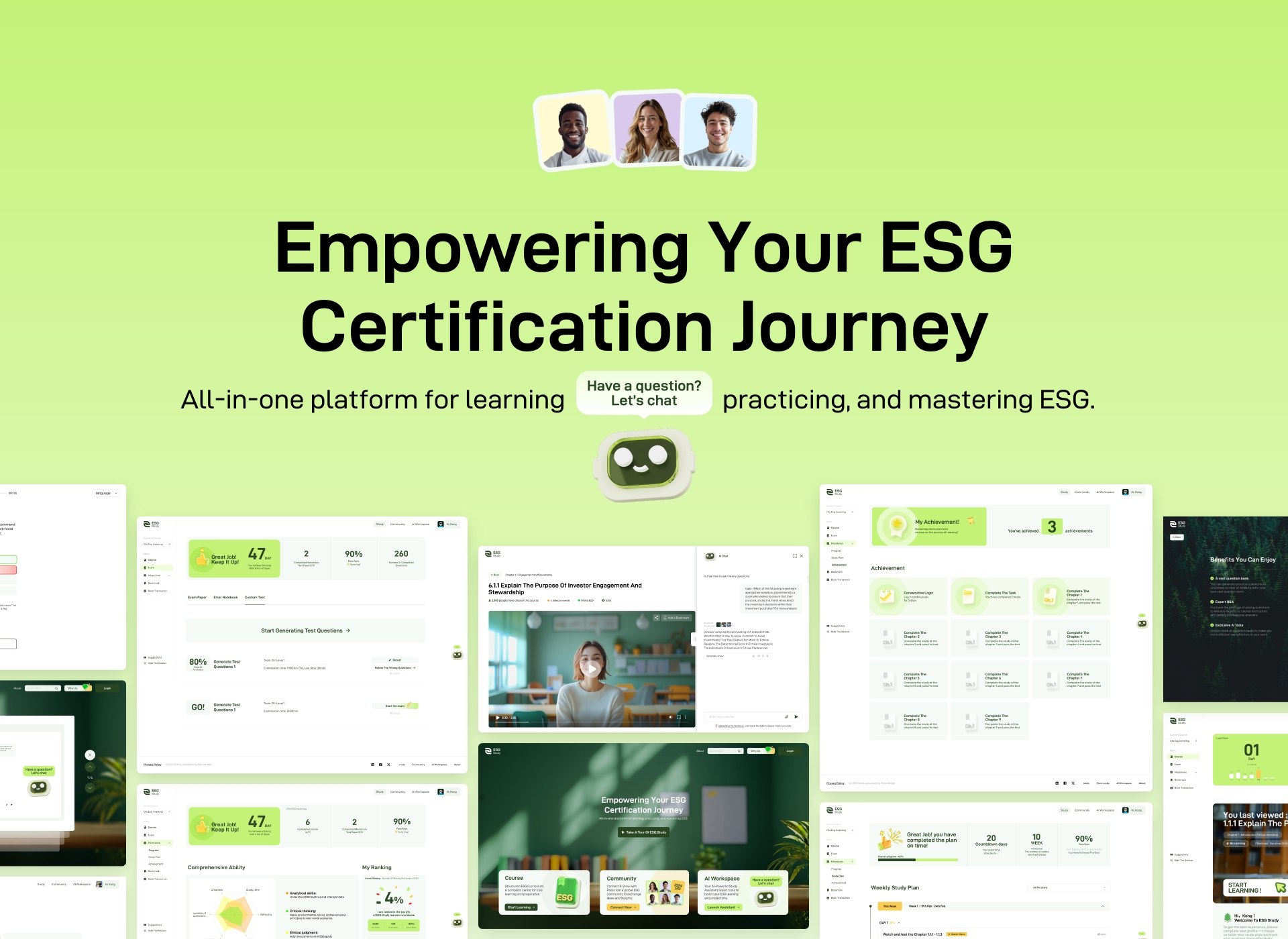
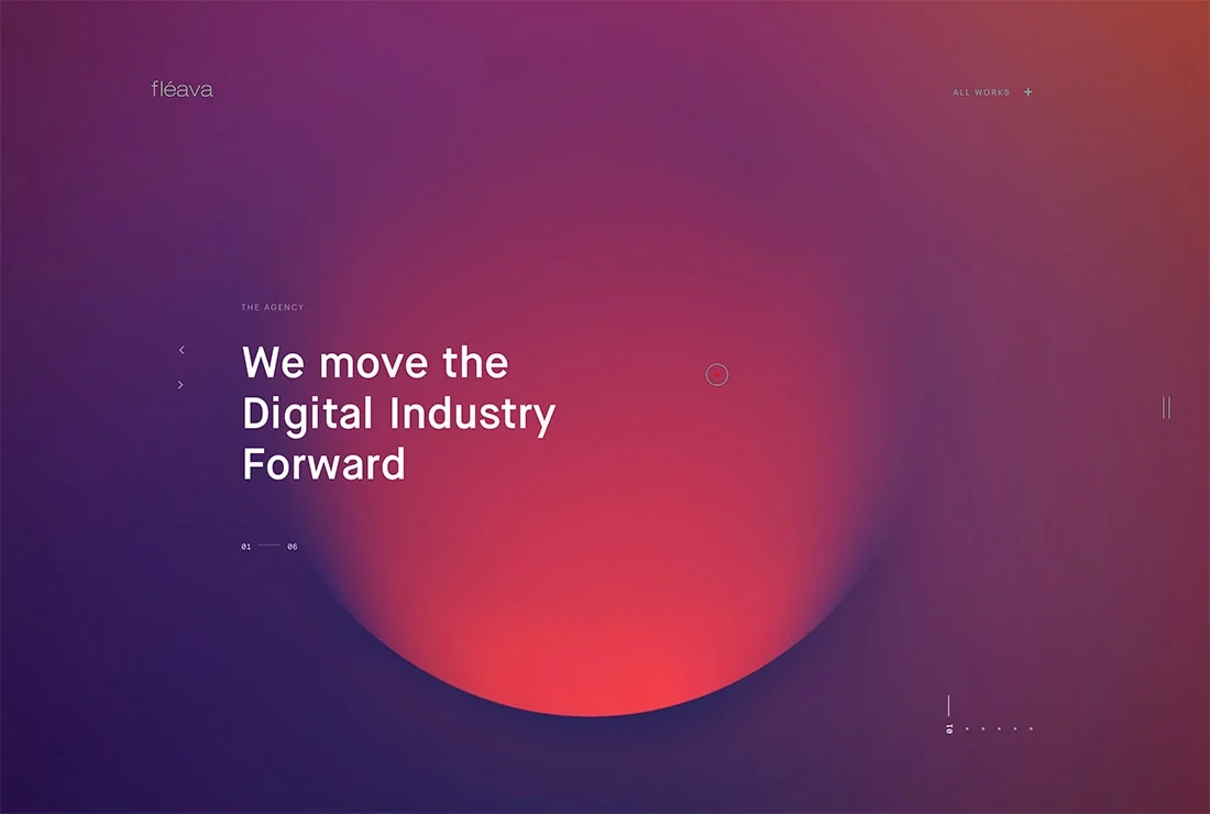
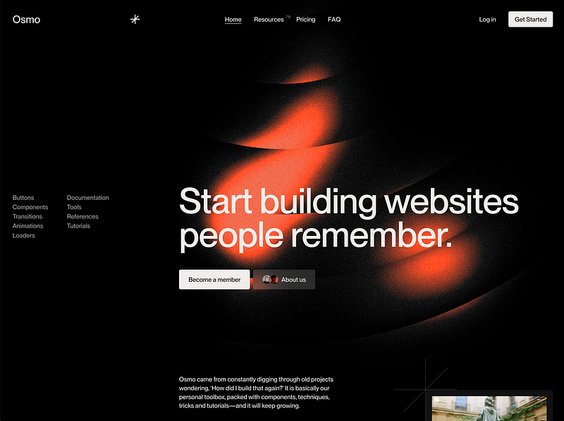
We often say a website "feels premium" or "has a strong presence," but if you ask how that’s achieved, many struggle to explain.
We've worked with many clients who begin by saying, "We're not really sure what to do with our website — we don't have a clear vision." That’s totally normal, especially for brands building their first site or dealing with complex content. It’s easy to feel overwhelmed.

We often describe websites as "feeling premium" or "having presence," yet when asked how that's achieved, many struggle to explain.
We always emphasize this: animation isn't for showing off — it's for enhancing experience. But too often, we see "animation overload": text flying everywhere, pages shaking, effects fighting for attention — turning the whole site into a digital disco.
Building a website is like running a restaurant — even the best content fails if customers leave during the wait. After testing 500+ corporate sites, our team found that many "visually stunning" websites suffer from critical speed issues. Here are 3 commonly overlooked optimization tips even developers might miss:
When I first started in design, I thought speed was everything—mastering software and chasing trends were the real skills. But after three years of client revisions at the Sumaart team, I finally understood: those truly enduring designs are often the result of stubborn persistence in front of the screen.
When people think of B2B websites, "boring" often comes to mind — packed with product specs, founder’s letters, and clichés like "industry-leading" or "globally recognized." But let’s be real: clients visit your site not for slogans, but for solutions. They want to know: "Do you truly understand my challenges? Can you solve my problems?" That’s where your website becomes your silent salesperson. So how do you make your expertise "perform" through design? Let’s keep it practical.
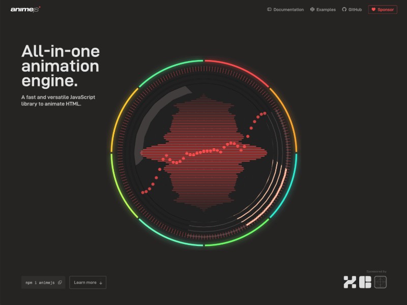
Animation, in simple terms, is "design that moves." But on a deeper level, it acts as an emotional guide during the user's journey. In a website redesign, well-planned motion isn’t just about looking premium — it’s about encouraging users to look longer, stay longer, and click further. So how can motion design be used effectively? Here are a few lessons from our experience.
Have you ever visited a website where the same URL shows different content to different people? Some see customized recommendations, others get coupon pop-ups — while some see just the standard layout. This isn't magic. It's called personalized user experience. So how can we use front-end technology to make websites "smarter" and more human-aware?
As designers, who hasn't experienced the "joy" of client revisions? When I first started, I thought my design sense was pretty decent. I'd submit work with confidence, only to have the client hit me with: "Can the logo be bigger?", "Can the colors be brighter?", "There's too much empty space — can we add another product image?", or "It just doesn't feel premium enough..."
Google data reveals a hard truth: 53% of users will abandon a website that takes more than 3 seconds to load. Is your official website still torturing visitors with outdated code and uncompressed 4K images?